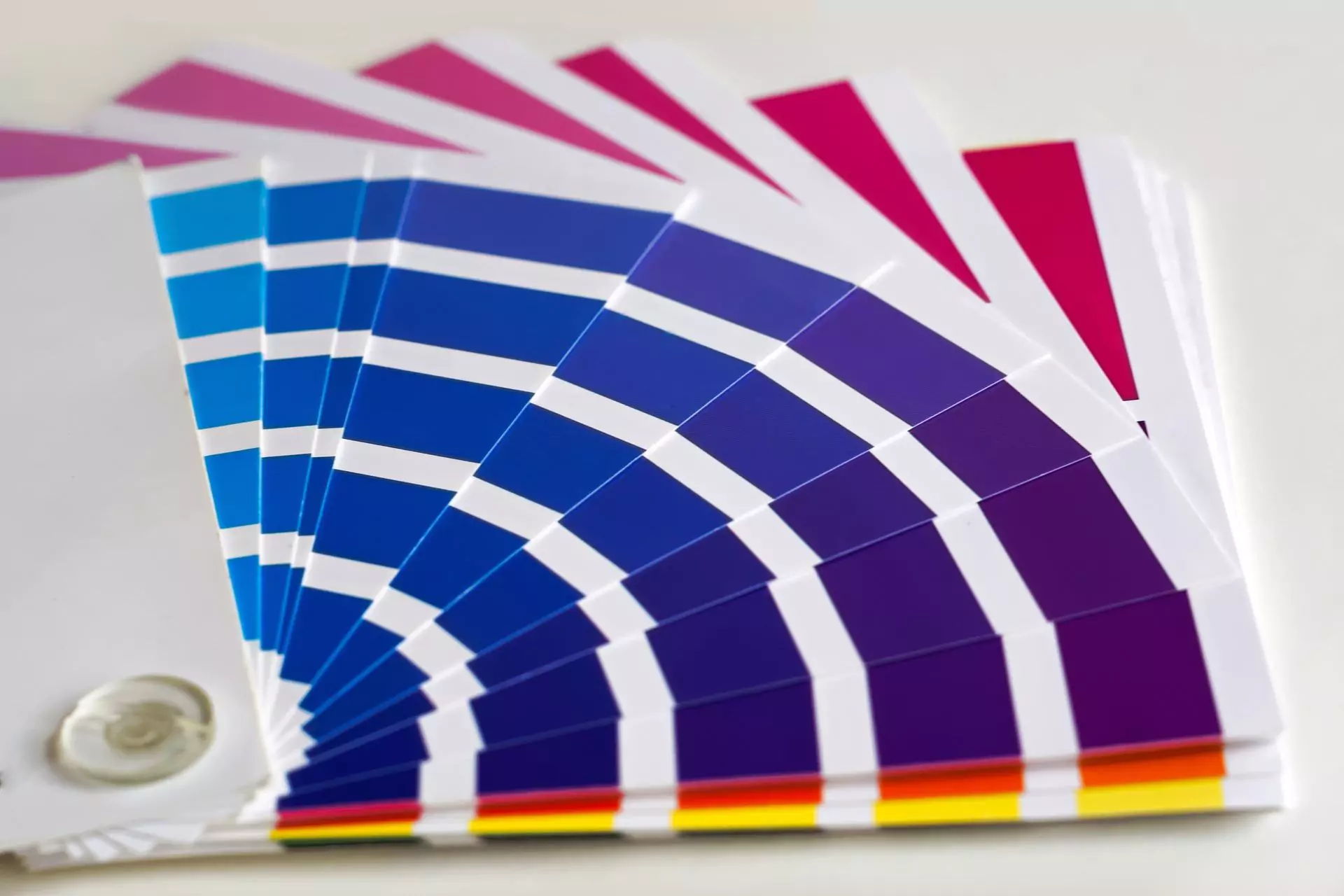
LESLIE: Well, painting is the easiest and least expensive way to completely change the look of your room. But unfortunately, it’s still something many do-it-yourselfers are shying away from.
Now, the main reason is: too much of a good thing. The colors available in the 
TOM: Very true. But if you can prevent yourself from becoming overwhelmed at the rainbow of paint chips, you will find that a new coat of paint can do wonders to perk up a tired room. With us to talk about that is Kevin O’Connor, the host of TV’s This Old House.
Welcome, Kevin.
KEVIN: Hi, guys. Great to be here.
TOM: So why do people always get that sort of deer-in-the-headlights feeling when they think about choosing a paint color?
KEVIN: Have you ever seen the paint wheel?
TOM: Yeah, it’s kind of overwhelming.
LESLIE: Which one? I have like a dozen.
KEVIN: And aren’t they all 300 colors? Four or five?
LESLIE: Beautiful.
KEVIN: Oh, no, way too much. Leslie, you are so right: it is overwhelming. And if you’re a guy, you’re at a bigger disadvantage because you probably are color-blind like me. It can be overwhelming.
And I think one of the reasons is lots of choices, as you say. But whatever decision you make, you’re going to be living with it for a long time. You’re not going to want to repaint your walls every year, so you’ve got to pick that color that works just right.
That being said, even though it may feel overwhelming, it is an inexpensive and effective way to make a big change. So people should not steer away from it.
TOM: What are some tips for picking that perfect color?
KEVIN: Well, I think you have to understand that color is basically style. And styles have trends. They come and go, right? And so, always be thinking about what are the trends that you’re seeing right now. And as it turns out, gray is sort of, for some reason, the big trend. People are using gray all over the place, different shades of gray. So, that is good to know.
LESLIE: Fifty. Fifty shades of gray.
KEVIN: That, too.
TOM: Exactly.
KEVIN: I’ve seen that for something else, I suspect.
So it’s good to know that there are trends out there. You probably want to find them so that you feel like the job that you’re doing is going to be contemporary and well-received. The one caution there is that, obviously, because it’s a trend, trends change. So you may have to actually change with the trends over the coming years.
TOM: Yep.
LESLIE: Or utilize that trendy color in a smarter or smaller application so that if it does change or you tire of it, it’s easier and more manageable to do so.
KEVIN: Well, you definitely can be thinking about accent colors and little places where you can dress up a room with just one color. And so think about some of the beautiful details that a lot of rooms have or that you can add.
A ceiling medallion would be a great way to introduce a pop of color. Wainscoting is a beautiful architectural detail. We often think about it as painting it white or just off-white but why not give it its own color? It’s not the entire room but you can bring some of those trendy colors in through those things. Same thing with molding details and such.
LESLIE: And I think one of the bigger trends this year – and we’ve been seeing it sort of recurring throughout this year and for the next year – is that the trend is to paint trim sort of in the similar color family to your wall color, maybe a shade darker with a different sheen, just to sort of bring in that color in a little bit more pungent or powerful way.
KEVIN: We have worked with a number of designers who have done just that. And quite honestly, a lot of times we just leave those decisions to the designers because they really know what they’re doing. But just like you said, Leslie, a wall color is – call it a “bluish color” and then the trim is sort of a lighter, slighter different color of the blue. And the ceiling, yet again, maybe drop it down another tone or two. Play with it like that.
And to my surprise, I would have that, “Oh, this is going to make a very busy room. This is not going to work.” Done right, it’s a very good effect.
LESLIE: Soothing.
TOM: Now, what about complementary colors beyond that? Is it true that opposites attract?
KEVIN: Well, one of the things that the designers always talked to us about is this idea of complementary colors. And what that means is if you look at the colors on a color wheel, you pick one color from one side and then you look at the other side of the color wheel and that would be a complementary color.
For example, red and green are on opposite sides of that color wheel. Now, that may sound a little bit Christmas-y if you think, “Oh, I’m going to paint the room with red and greens.” But it doesn’t have to be just a bold red or a bold green; you could be thinking about sage green for your walls and then the cabinets could be a dark cherry, which have the reddish hues. In that situation, you’re using that idea of complementary colors.
TOM: So what if you are inspired by something else in the environment, something that you have in your home? Maybe it’s a drape, a cushion; maybe it’s a leaf, some color that you really find really resonates well with you and you want to match that. You try to match it up against the paper samples or is there a better way?
KEVIN: Well, it’s a good place to start. You know, take some sort of a feature in the house that you love. And again, we work with designers who do this all of the time and say, “That is going to be the focal point right there.” And you might not have to replicate it perfectly but want to play off of it.
And the good news is is that if you go to the home centers, the paint-mixing technology right now is so sophisticated that you can pretty much bring in a swatch of anything – that curtain, that pillow, another paint color – and give it to them. And they can do a really good job of matching that color or giving you a hue or two off of exactly that color so that you can now play off of that feature that you want to play up.
LESLIE: And I think another interesting technology point is that so many of the paint manufacturers have on their websites – or have apps where you can sort of upload a picture of your room and then apply their paint colors to it, so to speak, in the applications so you can see it.
KEVIN: Imagine the old process of looking at a room and putting up some test paint on the wall, in a little corner or something like that, and then trying to have to imagine what that entire room would look like and make all these big decisions. Well, flash forward to today and do just what you said, Leslie: take a picture and paint the room virtually. Boy, that really gives you a leg up on making those sorts of decisions without having to do all the messy work of getting out the paint can and putting it up on the wall.
But I will say that’s a pretty good method, too, is to actually get it up on the wall. Get away from those small, little paint chips if you can. Use a much bigger paint chip or take a section of the wall – 3×5, 4×8 – and paint it there so that you can see it in the room, see how it adjusts to the light between morning, evening, during the day.
TOM: Good advice. Kevin O’Connor from TV’s This Old House, thank you so much for stopping by The Money Pit.
KEVIN: My pleasure, guys.
LESLIE: Alright. Catch the current season of This Old House and Ask This Old House on PBS. For local listings and step-by-step videos of many common home improvement projects, visit ThisOldHouse.com.
TOM: And This Old House and Ask This Old House are brought to you on PBS by The Home Depot. More saving, more doing.


Leave a Reply